ATR - Abruzzo Turismo in Rete Logo&Branding
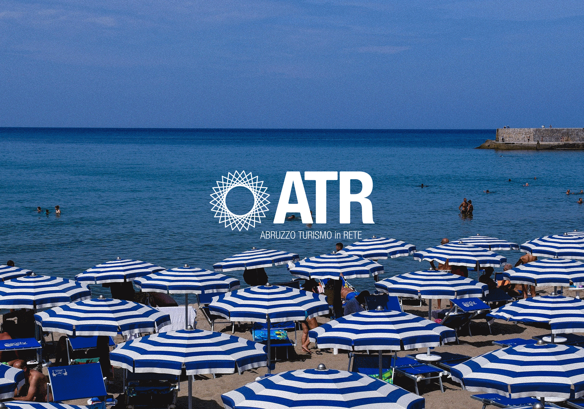
ATR, a network of tourism professionals from Abruzzo
(a central Adriatic region of Italy), approached me to design their LOGO.
I curated the entire creative process: from analyzing the brand’s values and identity to developing the concept and designing the logo. Additionally, I explored other branding elements to highlight the project’s potential. The goal was to represent an innovative network built on cooperation between local competitors and to celebrate Abruzzo’s unique identity through a contemporary and cohesive brand identity.
![]()
(a central Adriatic region of Italy), approached me to design their LOGO.
I curated the entire creative process: from analyzing the brand’s values and identity to developing the concept and designing the logo. Additionally, I explored other branding elements to highlight the project’s potential. The goal was to represent an innovative network built on cooperation between local competitors and to celebrate Abruzzo’s unique identity through a contemporary and cohesive brand identity.


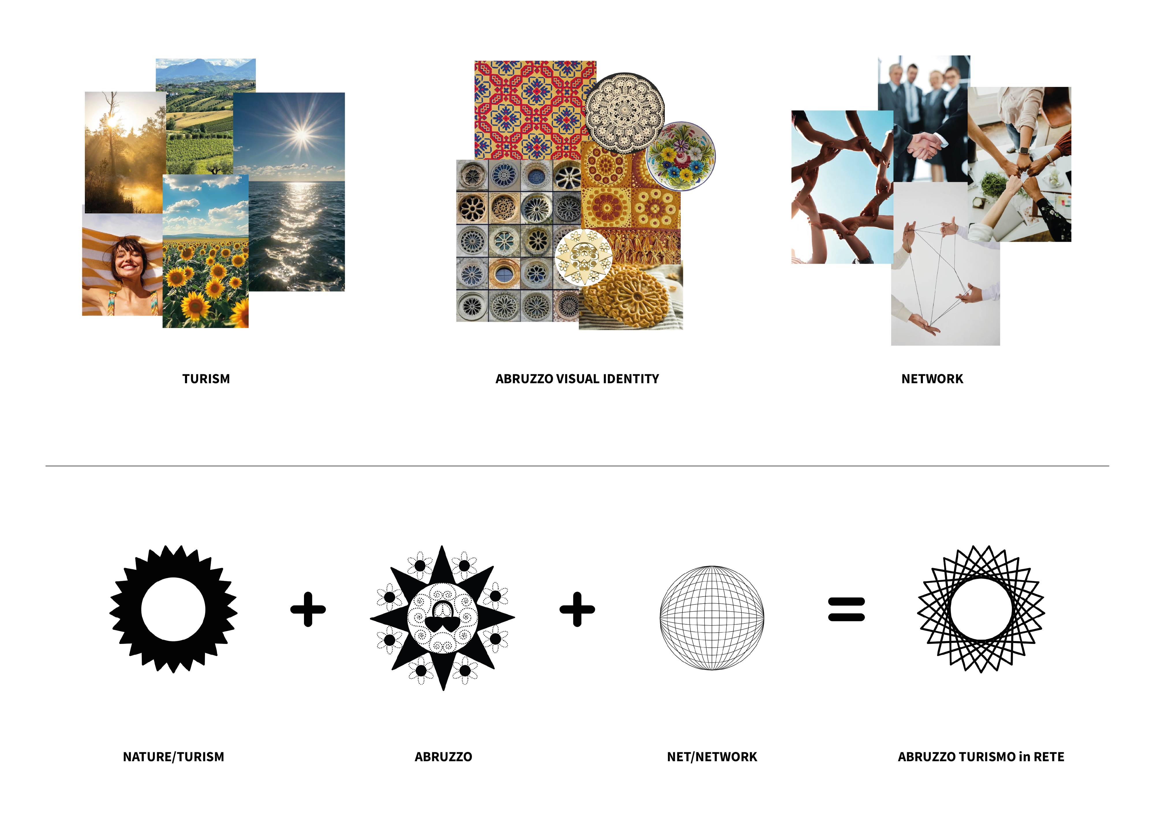
My clients didn’t have a specific idea at the start, but after my analysis and research, I identified two possible directions. One I called “The Solid Trustworthy One”, and the other “The Bold Visionary One”. Both aimed to convey exclusivity, trust, and reliability: the first emphasized solidity and the premium aspect, while the second highlighted innovation and the human network behind the business.
The clients chose the second approach.
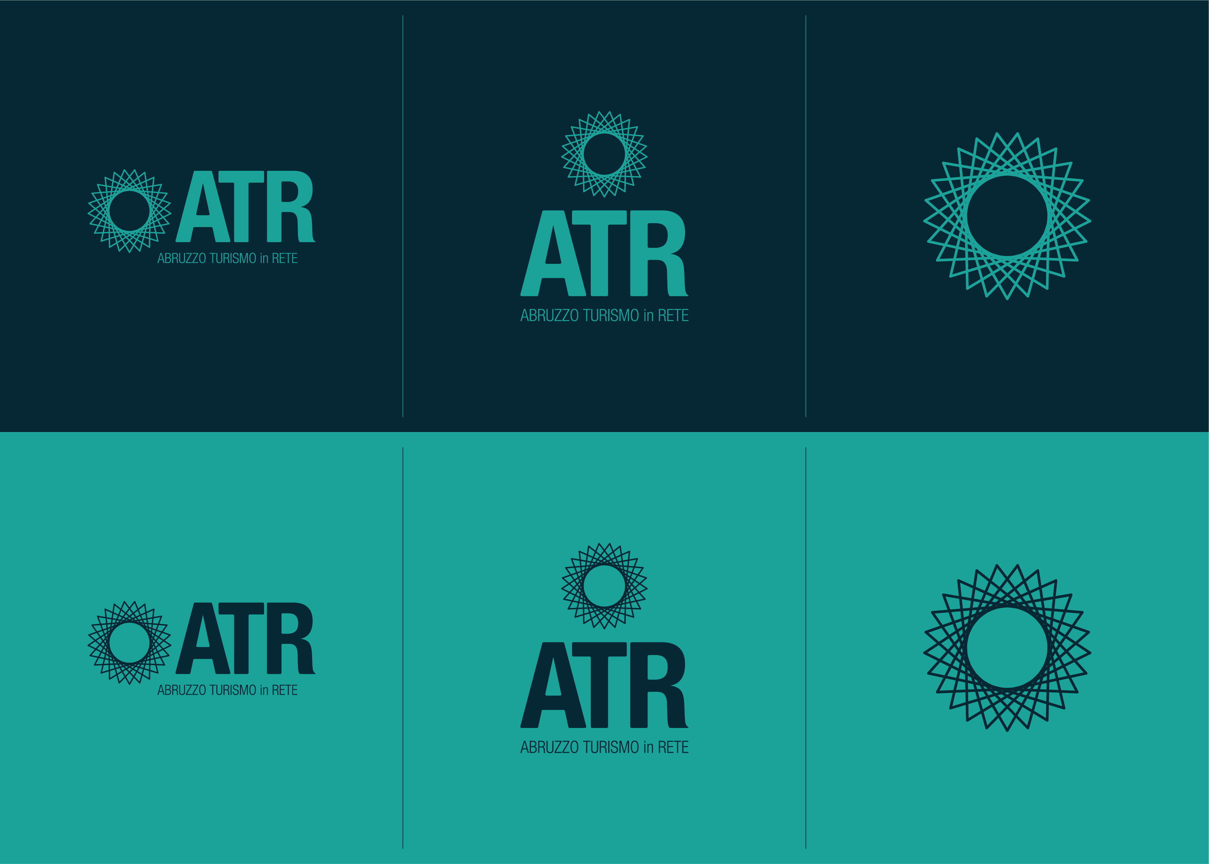
Other key elements were already embedded in the project’s name, which laid the foundations for my visual research: we’re talking about tourism, territory, and connection. How? In an innovative and contemporary way.

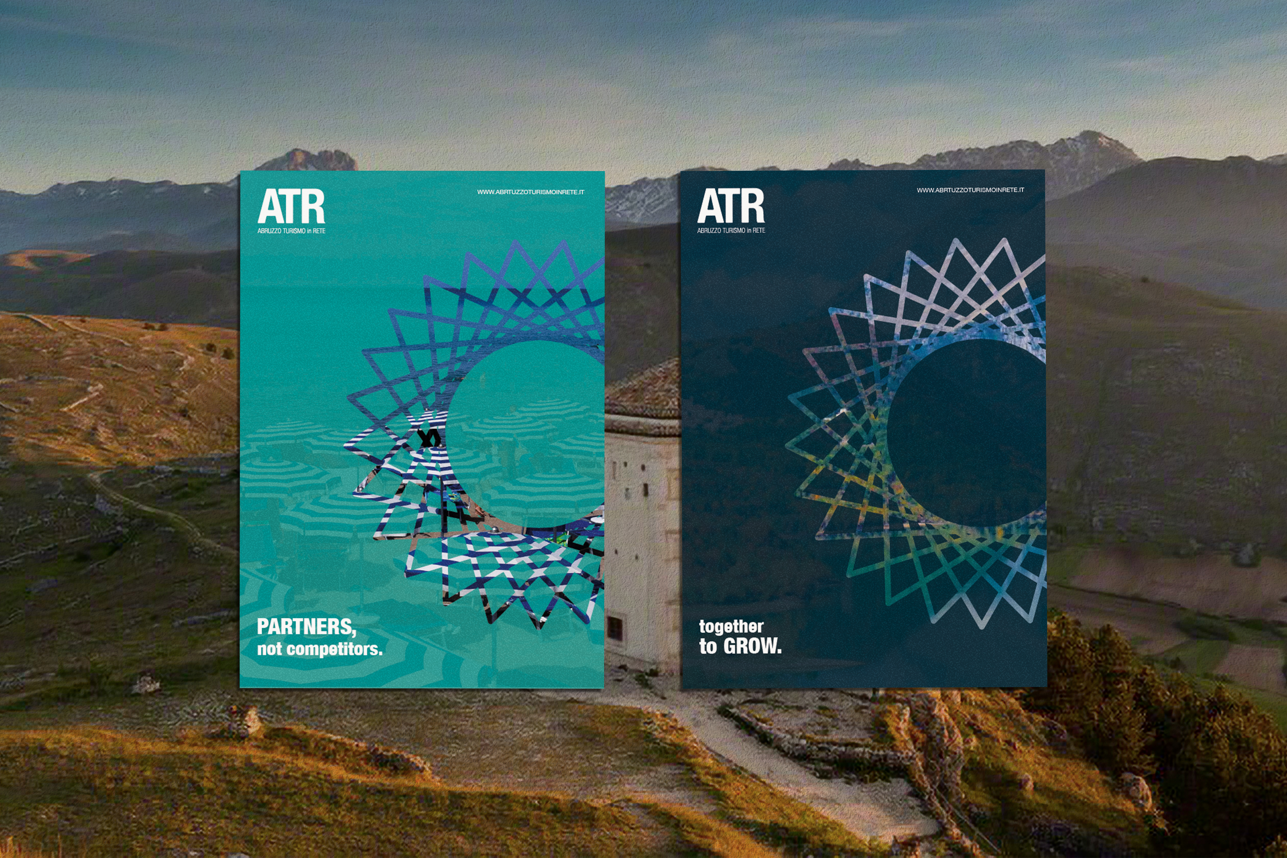
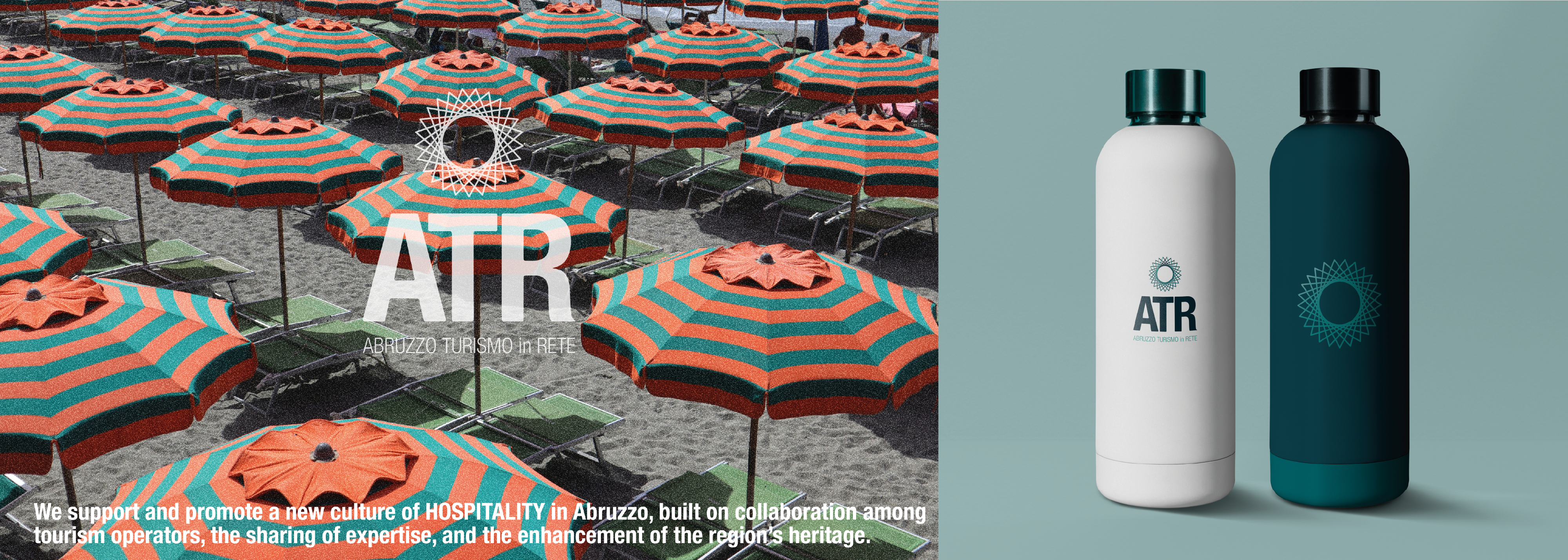
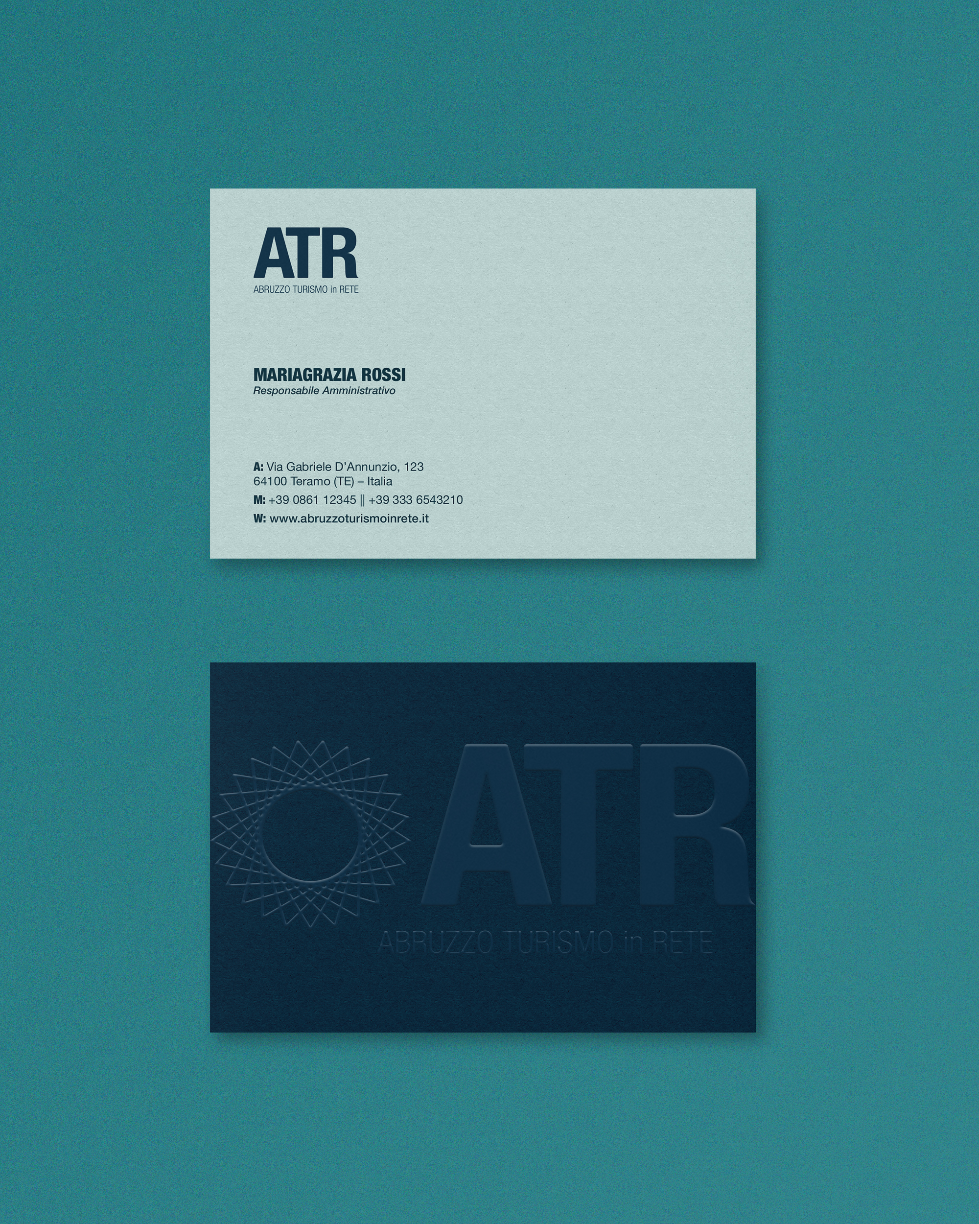
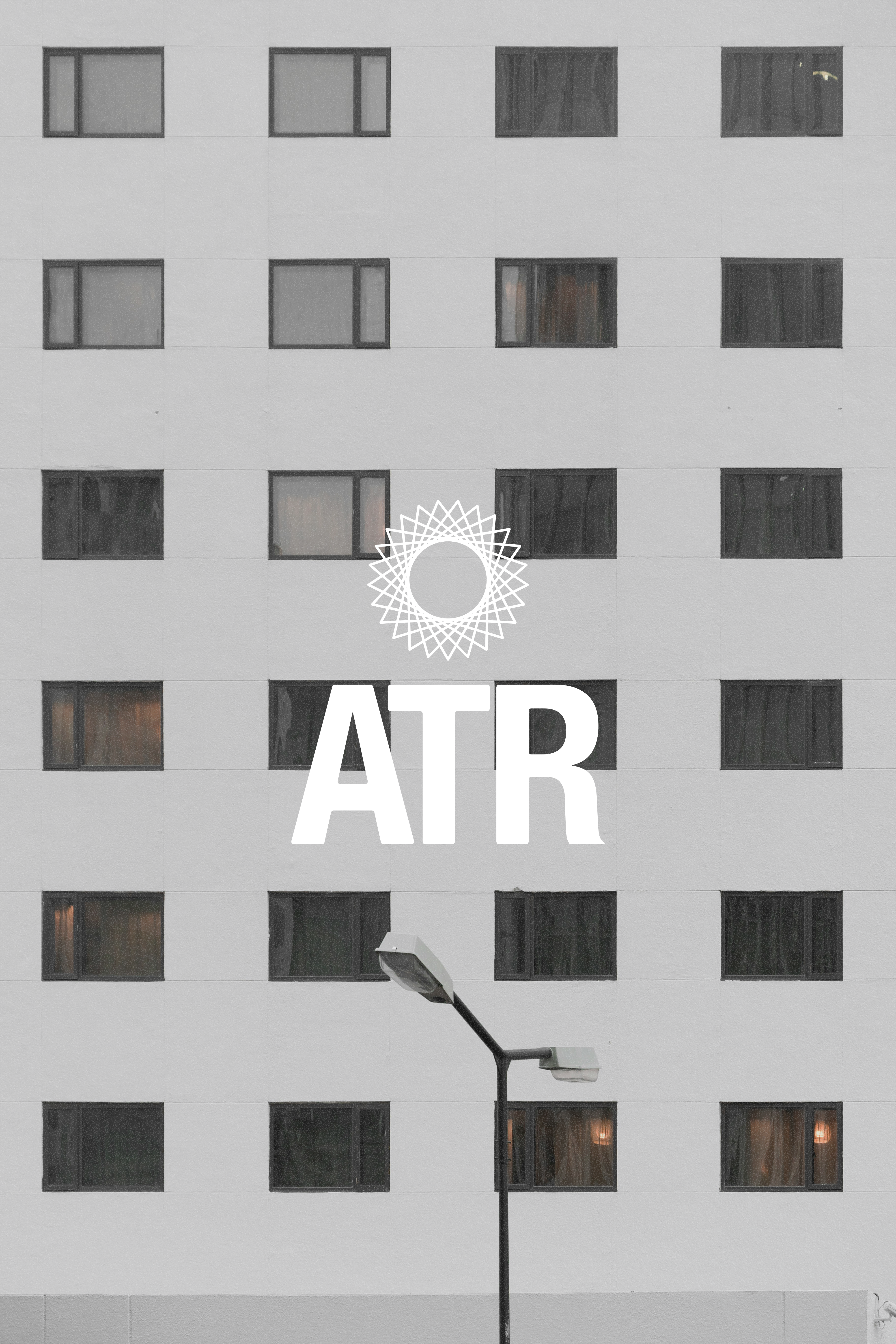
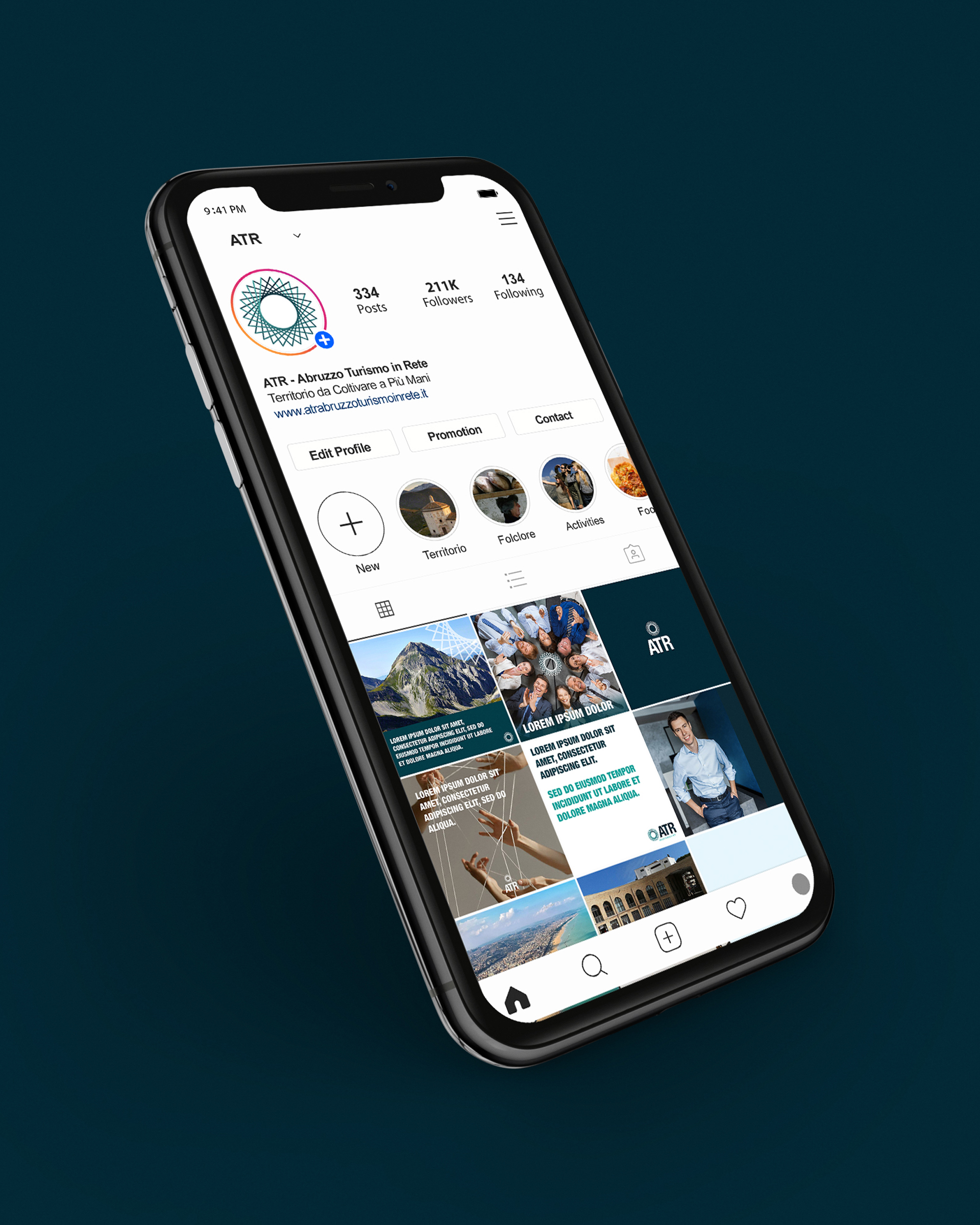
The project delivers a contemporary visual identity that reflects innovation, collaboration, and the unique character of Abruzzo’s tourism professionals, strengthening the sense of community and shared purpose within the network.
ATR - Abruzzo Turismo in Rete | Logo & BrandingLogotype and Branding for a Turism Professinal Network in Abruzzo (Italy), 2025.
︎ ︎ ︎ ︎
© 2025 by Sara Passamonti sarapcolmenares@gmail.com